Monday, March 20, 2017

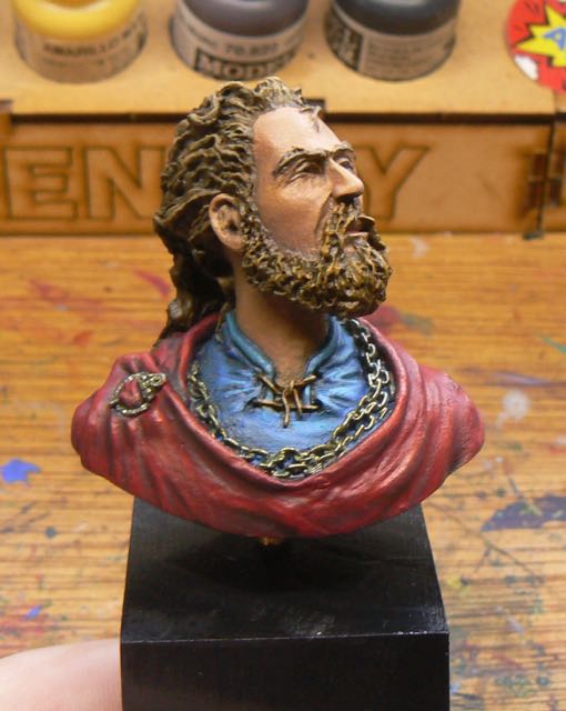
Viking Bust finished

Over the last two weeks I’ve been playing around with the Viking bust I have.  Along the way I purchased the book "Making Colour Sing" by Jeanne Dobie.  I’ve read a number of how-to painting books across oil/acrylic and watercolour techniques.  Mostly I’m trying to get a deeper understanding of painting composition and colour techniques.  Like all instructional books most say the same thing, just in different ways and with a different emphasis.

Viking Bust
Although this is a water colour specific book it had a very good section on complementary colour theory and neutral greys.  I’ve read this a number of times before but for some reason this one really clicked with me.  I finally (slow learner) realized that to get the colour pop that I’ve been looking for one of the secrets was to shade in the complementary grey of the colour you are painting.  When mixing complementary colours you end up with a ugly grey.  However by altering the ratio of the complementary colours that can be a green grey, a red grey, etc.  So for the red cloak I shaded down with a dark green.  The darker shades had some black mixed in too.  This meant that the red next to the green/grey would stand out more.

Highlighted side of face


I tried this on the face as well and finally started to get some real highlights.  Before I was adding in more white for highlights and getting a bleached out look, or shading with dark colours (to increase the contrast) and just making the flesh look muddy.  Now I got that the opposite of yellow is purple, hence why shading flesh with purple kind of worked in previous attempts.  Also this explained why VMA Armour brown was working (it has some purple in it) with my flesh mixes.

Again, all of this I had ready a number of times before but when I tried to apply that knowledge it didn’t work/click.  Finally it did.

Pre-shading on chain
For the gold chain I decided to do some pre-shading rather than do a heavy gold coat and then try and shade it.  So I used VMC Golden brown as the main pre-shade colour and used VMC Dark sea blue and VMC Flat yellow for the shades/highlights.  I’m still going with the directional light source so the chain closer to the light source was much lighter.  With just one coat of the gold I really got the effect I was after.  I did some extra highlights with VMA Aluminium and metal medium (aka sparkly paint).


I’m not 100% on the hair, but I’m finding the bulk of it slightly excessive and overflowing.  The figure must be using some serious hair gel to get those size ridges.

For the shirt my base as VMC Turquoise and VMC Prussian Blue.  I think this is where my new knowledge paid off the best.  Normally I just darken blue with dark blue/black.  Instead I used dark orange for the shadows under the face.  That really flattened out the blue.  I used light blue/white on the highlights and stayed away from any yellow (to avoid things going green).  Very happy with that shirt.

On the cloak I went too hard on the highlights on the shoulder and ended up with orange stripes.  So I went back and raised the colour of the shoulder in general and then redid the highlights.  I also cross hatched the highlight areas in an effort to show a bit of the cloth texture.  That worked a bit, but really I need to do the whole cloak with the cross hatching for that to work properly.

The base is a piece of pine chopped at an angle and painted satin black.  The figure is attached by a piece of brass tubing (1/8 inch).

So my first try in directional light is over.  It worked ok.  It looks like there is a brighter light from the side of the figure.  It isn’t extreme which would probably look better, but I think it is enough.  The figure is a bit odd in that logical highlight area is not on the front of the figure but I enjoyed the size of it.

Sunday, March 12, 2017

Frazetta’s Masterpieces - Act one Death Dealer (75mm) review


Recently the kickstarter for the 75mm (1/24) version of the classic Death Dealer finished and I received by order last week.  I went for the basic level.  So this meant just the figure and the free 54mm Ky-ra figure.

First up I’m a big fan of Frank Frazetta’s work and when this was first announced I ending up painting my old Ral Partha Super Hero which was a ‘homage’ to the painting in 25mm.  So I was looking forward to getting this although I almost wasn’t going to buy it (too afraid of 75mm horses I think).

Very well packed
The figure comes in a solid cardboard box with custom cut foam to hold the figure and a separate section for the base and the extra bits.  Interestingly the back of the box shows the horse having pins on the bottom of the feet but my horse does not have any.

Base
The base is quite solid.  There are holes for pins but as stated above the horse doesn’t have any.  So a bit odd there.

Main section


On the horse figure, it is great.  The painting has a very strong and violent looking horse and the sculpt captures that very well.  To be honest I like the horse over the figure in both painting and sculpt.

Pinched front legs


The only down side is that the front legs of the horse are slightly pinched.  They don’t match up to the mount points on the base due to this.  I’m not sure if this can be corrected with heat alone or if the legs will need to be cut and realigned.

Rider detail


The figure itself is just as good as the the horse.  Very clean cast and nice details.  The ringmail(?) on the lower part of the figure does sometimes end up looking like a row of dots however.  It’s a bit too straight in some sections and ends up looking like someone just ran a the end of a piece of rod down the putty in a line instead of creating interlinked rings (i.e. in an under/over pattern).  So the sculpt is true to the painting, but I find it looks a bit odd in 3D.

Rider detail


For the face, well there isn’t much detail in the original painting, just a lot of dark shading.  So the sculpt is good, but it doesn’t match what I always had in my mind of what the face area should be.

Extra bits, shield, head


Head

WRT to the Viking bust I’m making good progress on it.  I did some (more) reading of leaning to paint books and something finally clicked (it’s nothing new, it was just presented in a way that finally sunk in for me).  I’ve managed to do things a bit better and am much happier with what I’m turning out.  More on that next week.

Saturday, March 4, 2017

Tribal Warrior done and Viking bust started

After a bit more of a break I finished off the Tribal Warrior.  Or more correctly gave up and just finished it.  My heart just wasn’t in it to be honest and I never should have started it.  One of those “well I bought it, I should paint it..” times.

Tribal Warrior


For the metal's I kept them very cool and that seemed to work out.  For the highlights I used some Vallejo Metal Medium.  Basically the sparkle in metallic paints, not pigment at all.  Makes the Aluminum paint I have look dull :)


For the shield I couldn’t work out what to do so after doing a whole lot of brown shading I covered the shield in AK Worn Effect chipping fluid and painted it red.  Then I wore back the paint to uncover the wood.  The end result wasn’t too bad.

Top view
It needed some more work but by this stage I was done.  The figure got based and into the cupboard with it.

1/16 Viking Bust
Recently I purchased a 1/16 bust of a Viking.  He has very squinty eyes suggesting that he is looking into the sun.  So I decided to try for a very directional light in the shading (instead of the usual zenithal approach).  I didn’t want to go the whole OSL ‘lantern in the dark’ look, more of a sun bleached look.  I’ve just blocked in the shirt, cloak and hair so far.  I did a lot of work on the face and then the wife told me I had made it too yellow (trying of the sun look).  Yep, he had some serious health issues.  So I’m now repainting it with more red in the mix.

Attempts at directional lighting
Instead of the normal flesh colours from the pot I’m mixing my flesh again.  I’m using a base of

VGC Leather Brown
VMC Red
Jo Sonja’s white - really liking this white, seems warmer than the VGC Dead white.
VMC English Uniform
VGC Plague Brown
VMC Golden Brown

Shade down with
VMA Armour Brown
VMC Violet Red
VMC Dark Sea Blue

Highlights with
VMC Light Yellow
more white

The small amount of red is needed to stop the attack of the yellow skin condition.  However it is really a tiny amount in the mix.  Any more than a pin head and it’s pink city.  I’m wondering that as my flesh mix ends up close to the standard Vallejo flesh colours am I just make a rod for my own back?  Jury out on that one.

I’m trying to get the whole ‘shade with a complementary colour’ technique to give a wider range of colours to make the figure pop some more.  The idea of having the full colour spectrum in an area and using the natural grey of two direct complementary colours to enhance (read pop) the features.  I found at Cancon my figures looked really flat compared to the better figures.  I’m also trying to do the shades in cool colours and highlights in warm colours.  Most times I fail and over use yellow (see note about unhealthy skin above).

Hair too light, darker now
Since the picture I’ve redone the hair to be much darker.  It matches the skin a bit better as I was finding the beard highlights were getting very unnatural on the original hair colour.

Sunday, February 19, 2017

New paint rack and work on Tribal Warrior (orc)

New paint racks

I’ve purchased some Jo Sonja paints recently for terrain painting and also for general painting.  However they have been sitting in a pile and always seem in the way.  So I decided it was time to make a paint rack for them.  My painting area is next to an Ikea Billy bookcase so under one of the bookshelves I attached some home made paint rails (like the ones the paints are sold on in a shop).  Just some pine strips with some 3mm ply glued on underneath and then the whole lot was painted and screwed into the shelf.  Gets the paints out of the way and under the paints I have room for some more bits and pieces.

Tribal Warrior

On the Tribal Warrior I spent a bit of time playing around with him.  I’m trying a new idea of around zenithal lighting where the areas in light should be highly detailed and the areas in shadow less so.  This was one of the ideas I picked up from the book “Colour and Light”  by James Gurney.  On the fur cloak I gave this a try.  As I progressed down the cloak the contrast between the base coat and the highlights and shadows was reduced.  At the top of the cloak I tried to maximise the colour variation.  All of this is to try and draw the eye to the top of the figure and the face.


I’ve still thinking about the flesh colours.  I tried for the light green/yellow orc skin and had some trouble.  In my first attempts he ended up going the full zombie so I had to add a lot of yellow to bring that back.  Also adding some red and purples to the mixes helped.  It still isn’t great.

Next up will be the armour that I’m trying with metallics first.  I’m not sure the cool temperature metals are really working.  However bone armour doesn’t work and I’m a bit stuck for what colour to try instead.

Sunday, February 12, 2017

Heat induced time off

Well I planned to have a week off after Cancon but that kind of stretched to two weeks due to the heat wave going through Sydney currently.  Over 30 degrees C isn’t much fun and over 35 painting just isn’t possible.  Even in a wet palette the paint dries out too fast.  However today it cooled off a bit so I could get back and do a few things.

Battlefield accessories row boat
The small mdf rowboat I purchased from Battlefield Accessories I glued together and used some wood putty on the outer hull to smooth it out.  I simple paint job and it’s ready to be added to the box of 28mm terrain.  I am thinking that I need a person fishing…


I helped both kids with their mdf building from Knights of Dice.  The daughters farm house is put together and she has started painting it.  We did the tile roof in the old school “cardboard packing cut into tiles” method and put glue everywhere.  Just needs the ridge caps to finish off.  My son glued many rocks/etc onto his ruins and that is currently in the shed airing off after undercoating.

Little farm house
I got out the “Tribal Warrior (Orc)” from the Twelve Elements of War range that I purchased at Cancon two years ago.

Tribal warrior
I’ve pre-shaded him and now need to work out a colour scheme other than boring brown with red-brown fur.  Not even sure if I’ll paint him green.  Maybe go for more of an ogre look (he does have slightly pointed ears).  While thinking about that I made a small wooden base for him.  I used the top of a resin rock I had cast (yes, it’s lime green - the overrun from another job) to add a bit to the base.  I won’t do anything more as he is more an experiment in smaller scale while I think about what larger project I’ll do next.

Tribal warrior arms