Showing posts with label viking. Show all posts

Monday, March 20, 2017

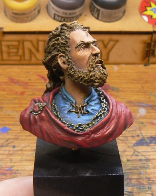
Viking Bust finished

Over the last two weeks I’ve been playing around with the Viking bust I have.  Along the way I purchased the book "Making Colour Sing" by Jeanne Dobie.  I’ve read a number of how-to painting books across oil/acrylic and watercolour techniques.  Mostly I’m trying to get a deeper understanding of painting composition and colour techniques.  Like all instructional books most say the same thing, just in different ways and with a different emphasis.

Viking Bust
Although this is a water colour specific book it had a very good section on complementary colour theory and neutral greys.  I’ve read this a number of times before but for some reason this one really clicked with me.  I finally (slow learner) realized that to get the colour pop that I’ve been looking for one of the secrets was to shade in the complementary grey of the colour you are painting.  When mixing complementary colours you end up with a ugly grey.  However by altering the ratio of the complementary colours that can be a green grey, a red grey, etc.  So for the red cloak I shaded down with a dark green.  The darker shades had some black mixed in too.  This meant that the red next to the green/grey would stand out more.

Highlighted side of face


I tried this on the face as well and finally started to get some real highlights.  Before I was adding in more white for highlights and getting a bleached out look, or shading with dark colours (to increase the contrast) and just making the flesh look muddy.  Now I got that the opposite of yellow is purple, hence why shading flesh with purple kind of worked in previous attempts.  Also this explained why VMA Armour brown was working (it has some purple in it) with my flesh mixes.

Again, all of this I had ready a number of times before but when I tried to apply that knowledge it didn’t work/click.  Finally it did.

Pre-shading on chain
For the gold chain I decided to do some pre-shading rather than do a heavy gold coat and then try and shade it.  So I used VMC Golden brown as the main pre-shade colour and used VMC Dark sea blue and VMC Flat yellow for the shades/highlights.  I’m still going with the directional light source so the chain closer to the light source was much lighter.  With just one coat of the gold I really got the effect I was after.  I did some extra highlights with VMA Aluminium and metal medium (aka sparkly paint).


I’m not 100% on the hair, but I’m finding the bulk of it slightly excessive and overflowing.  The figure must be using some serious hair gel to get those size ridges.

For the shirt my base as VMC Turquoise and VMC Prussian Blue.  I think this is where my new knowledge paid off the best.  Normally I just darken blue with dark blue/black.  Instead I used dark orange for the shadows under the face.  That really flattened out the blue.  I used light blue/white on the highlights and stayed away from any yellow (to avoid things going green).  Very happy with that shirt.

On the cloak I went too hard on the highlights on the shoulder and ended up with orange stripes.  So I went back and raised the colour of the shoulder in general and then redid the highlights.  I also cross hatched the highlight areas in an effort to show a bit of the cloth texture.  That worked a bit, but really I need to do the whole cloak with the cross hatching for that to work properly.

The base is a piece of pine chopped at an angle and painted satin black.  The figure is attached by a piece of brass tubing (1/8 inch).

So my first try in directional light is over.  It worked ok.  It looks like there is a brighter light from the side of the figure.  It isn’t extreme which would probably look better, but I think it is enough.  The figure is a bit odd in that logical highlight area is not on the front of the figure but I enjoyed the size of it.

Saturday, March 4, 2017

Tribal Warrior done and Viking bust started

After a bit more of a break I finished off the Tribal Warrior.  Or more correctly gave up and just finished it.  My heart just wasn’t in it to be honest and I never should have started it.  One of those “well I bought it, I should paint it..” times.

Tribal Warrior


For the metal's I kept them very cool and that seemed to work out.  For the highlights I used some Vallejo Metal Medium.  Basically the sparkle in metallic paints, not pigment at all.  Makes the Aluminum paint I have look dull :)


For the shield I couldn’t work out what to do so after doing a whole lot of brown shading I covered the shield in AK Worn Effect chipping fluid and painted it red.  Then I wore back the paint to uncover the wood.  The end result wasn’t too bad.

Top view
It needed some more work but by this stage I was done.  The figure got based and into the cupboard with it.

1/16 Viking Bust
Recently I purchased a 1/16 bust of a Viking.  He has very squinty eyes suggesting that he is looking into the sun.  So I decided to try for a very directional light in the shading (instead of the usual zenithal approach).  I didn’t want to go the whole OSL ‘lantern in the dark’ look, more of a sun bleached look.  I’ve just blocked in the shirt, cloak and hair so far.  I did a lot of work on the face and then the wife told me I had made it too yellow (trying of the sun look).  Yep, he had some serious health issues.  So I’m now repainting it with more red in the mix.

Attempts at directional lighting
Instead of the normal flesh colours from the pot I’m mixing my flesh again.  I’m using a base of

VGC Leather Brown
VMC Red
Jo Sonja’s white - really liking this white, seems warmer than the VGC Dead white.
VMC English Uniform
VGC Plague Brown
VMC Golden Brown

Shade down with
VMA Armour Brown
VMC Violet Red
VMC Dark Sea Blue

Highlights with
VMC Light Yellow
more white

The small amount of red is needed to stop the attack of the yellow skin condition.  However it is really a tiny amount in the mix.  Any more than a pin head and it’s pink city.  I’m wondering that as my flesh mix ends up close to the standard Vallejo flesh colours am I just make a rod for my own back?  Jury out on that one.

I’m trying to get the whole ‘shade with a complementary colour’ technique to give a wider range of colours to make the figure pop some more.  The idea of having the full colour spectrum in an area and using the natural grey of two direct complementary colours to enhance (read pop) the features.  I found at Cancon my figures looked really flat compared to the better figures.  I’m also trying to do the shades in cool colours and highlights in warm colours.  Most times I fail and over use yellow (see note about unhealthy skin above).

Hair too light, darker now
Since the picture I’ve redone the hair to be much darker.  It matches the skin a bit better as I was finding the beard highlights were getting very unnatural on the original hair colour.

Sunday, May 3, 2015

54mm face painting, Ice Viking in 28mm and some static grass

A mixed bag this week.  I spent the first part of it working on the face and hair of my 54mm knight figure.  There isn’t much flesh on the figure as the alternative head I choose has a beard.  So I went for my usual flesh range (dark to light) of

VPA Shadows Flesh
VMC Medium Flesh (base)
VMC Dark Flesh
VMC Flat Flesh
VGC Dead White

Yes, Medium Flesh is darker than Dark Flesh :)  I also usually add some dirt shadows with Earth or so other dark tan.  After all there wasn’t much washing in the middle ages.  I took the highlights beyond what I normally do (I have the Cancon painting classes with Meg Maples/Mark Soley to thank for that) and yes, it does look better.  At a few meters away the face really pops.  Not 100% on the right eye, I think it may have to move up slightly.  Never been good at eyes and my own eyes aren’t helping things as they get older.
Slightly over exposed there..

For the hair I tried something different and went for fully white hair.  Normally I do the standard brown or grey.  The base colour was a warm off white (i.e. looked a bit yellow) VMC Light Sand.  Rather than do my 28mm hair technique of doing a dark wash followed by some dry brushing I tried to paint the entire hair as one piece, much like painting an irregular shaped sphere.  Another technique picked up thanks to the internet.  This was helped as the sculpt had the hair in waves down the head.  I medieval perm job.  On the underside of hair wave I shaded down with a tan yellow to brown and on the top of the waves I highlighted up with flat white to gloss white.  The end result was a little harsh on the shadows, so I need to go back and have another go.  But this is the way to paint hair so it looks like hair rather than strands of straw.


Still not being sure of the main colours for the knight I did a test figure using an old Ral Partha 28mm figure.  I went for a cool (blue) white for his shirt and a light blue for the cloak.  For the flesh I went for a lighter nordic skin colour and made the VMC Dark Flesh the base.  For the white tunic my range was

VGC Ghost Grey + VGC Dead White
VGC Dead White
VMC Gloss White
VMA White - I find the airbrush range white is great.  Very bright but totally smooth.

For the blue cloak the range was

VGC Magic Blue
AP Electric Blue (the lightest blue I had)
VGC Dead White
VMA White


So a “grey white” and “blue white” combo.  The blue cloak was too dark for what I was aiming for.
The final highlights of white are too extreme next to the Magic Blue.  Next time I will start with a lighter blue.  I’m also going to trial some snow effects for the first time on his base.  I’m not sure if the 54mm knight will have snow but currently he is looking like being a very cold colour scheme so the snow would add to that.

I’ve been doing some reading of various learn to paint oils/acrylics/etc books to expand and improve my skill set.  Something I picked up was that it is almost impossible to make a colour lighter and brighter by mixing.  By adding white you make the colour lighter/whiter but adding white always makes the colour duller.  Mixing any two colours will always also result in a colour darker than the lightest.  This is because paint is colour subtractive.  So for really light colours you need to buy them.  So after 30mins of trying to make a blue lighter and brighter than the AP Electric Blue I found those books know what they are on about.  I could get a lighter blue, but it was dull as.  Luckily I’m 5 mins away from The Combat Company so I went and grabbed a pot of VMC Sky Blue.  This is all going towards doing the cloak of the knight as a faded out blue.  So a very light blue base up to white/linen due to sun fade and weather.


Finally in all that excitement I finished off the bases of my two Flemish warriors with my usual dirt mix, flock and static grass.  More recently I’ve started to paint the grass tufts a few different greens and yellows to break up the uniformity.  Green base rims just to kick it old school.